
|
|
|
|
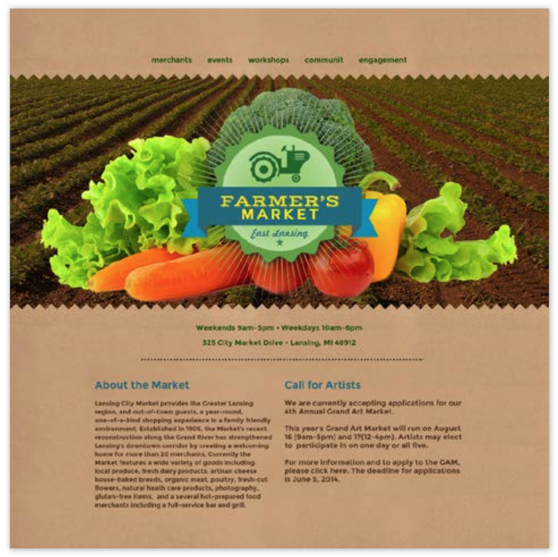
The above pieces are some of the graphic design work I did for my Intro to Design class at Michigan State University. I followed tutorial videos from the professor on how to make certain design pieces on Adobe Illustrator, Photoshop, After Effects, and InDesign.
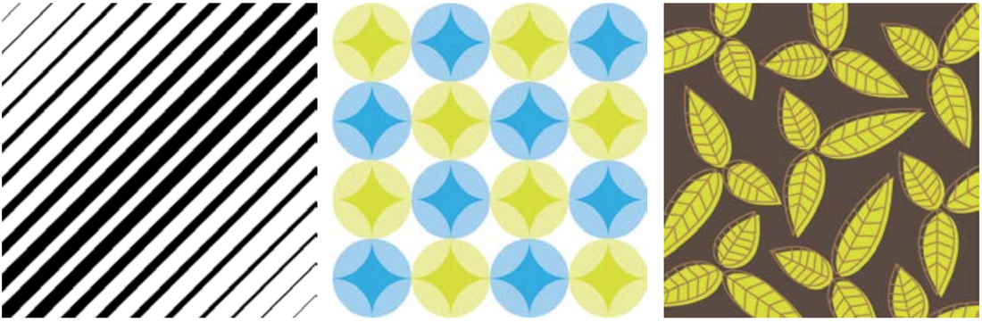
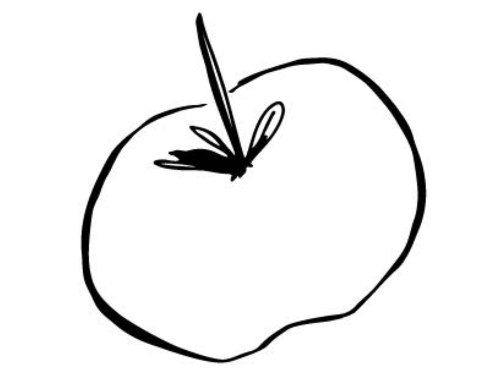
These three pieces were made using Adobe Illustrator.
|
|
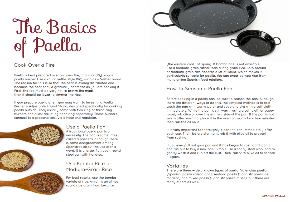
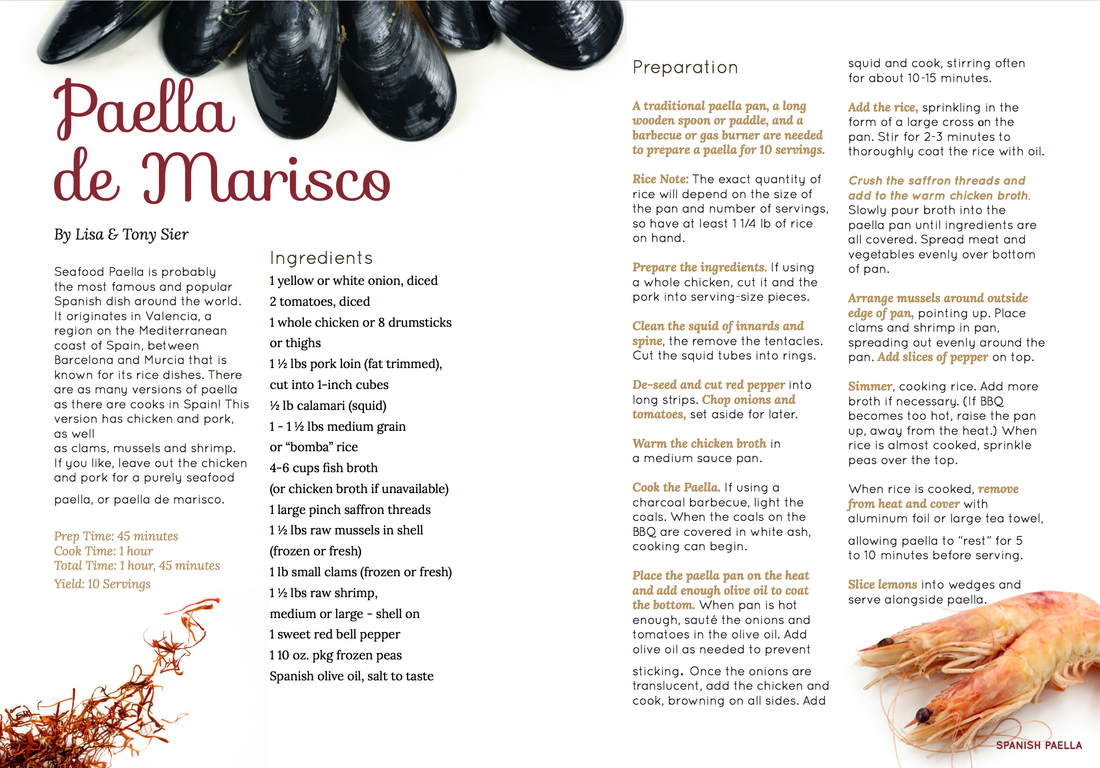
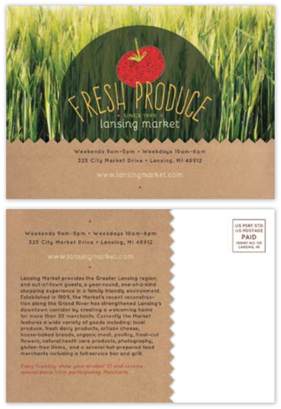
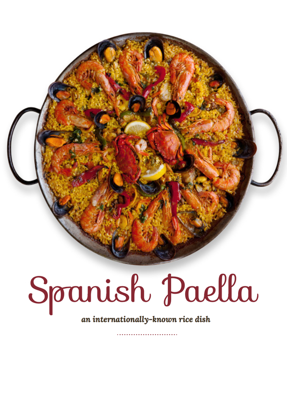
The above pieces were created with InDesign. The assignment was meant to expose us to the understanding of creating text, placing images correctly, and to overall format pages for a recipe of a cook book.
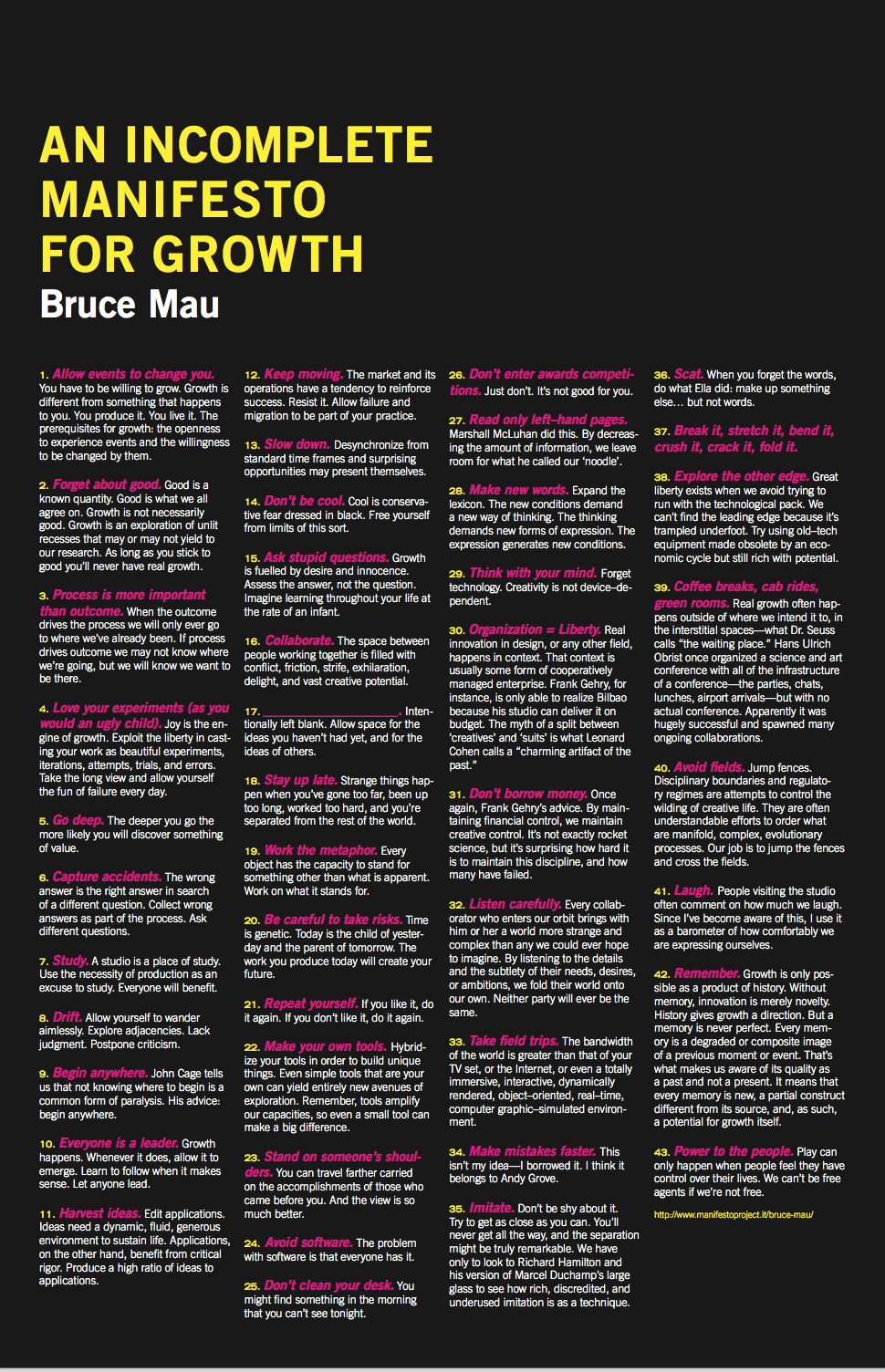
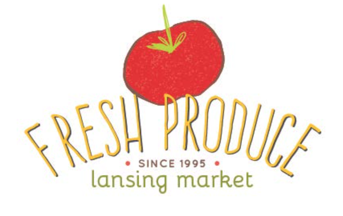
This was another InDesign assignment I did for the same class where we worked with formatting, using correct texts, fonts, colors, and size.
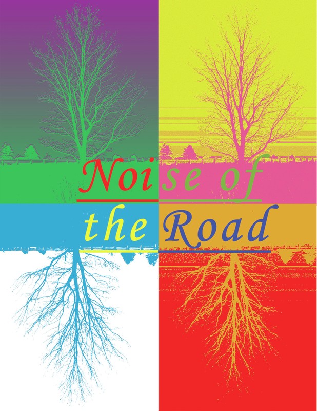
This piece was created for my Design and Layout class during my junior year at Michigan State University. I made it on Adobe Photoshop and the assignment was to create a poster. I took a photo of a tree on the side of a highway. Whenever I pray/meditate I quiet my mind and listen to the sounds around me and I mostly hear the noise of the road. I usually associate that sound with serenity and calmness. This is how I received my inspiration for the poster. I decided to add color filters to the image by using two colors for each time I repeated the image, which was four times. It is meant to create a surreal psychologically feeling, by when you see the contrasting and complementary colors with each other. It creates a dream-like feel to it which is what I was trying to portray and also capture the different feelings of the seasons.
This is another project I completed for my Intro to Design class. The requirement was to put a drawing into a video made in After Effects. I did a drawing of a red-eared slider turtle, scanned it onto my laptop, edited it on Adobe Illustrator, and added in the preferred colors.
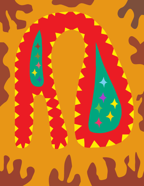
This piece was created for a graphic design assignment that I had to complete for my Design and Layout class. The requirement was to create a logo with our initials and it had to describe our personality. Since I describe myself as wild and energetic I wanted to convey that energy in the logo. I created this piece using Adobe Illustrator.
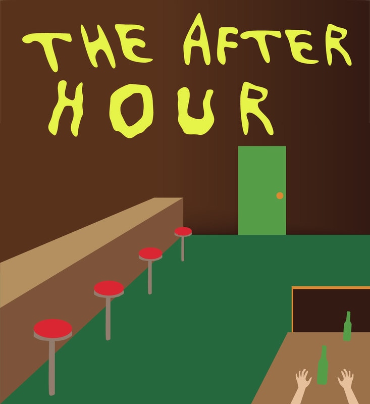
This is a poster I created for a film titled, "The After Hour". The film was a project I completed with the help of classmates from MSU. It portrays a story about a man who is visited by the spirit of a friend who has recently passed away. The spirit tells the man his experiences with the afterlife. I wanted the poster to have a minimalist approach similar to the style of graphic designer Saul Bass.
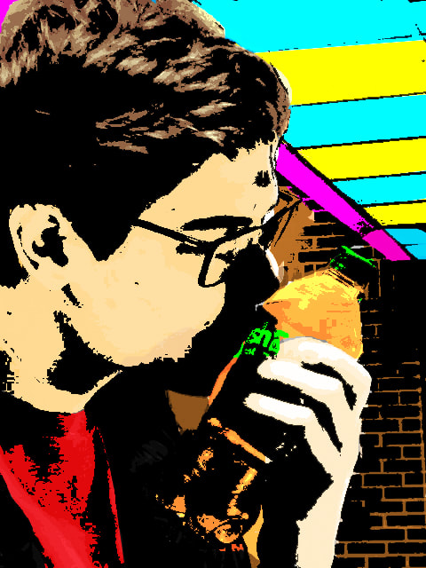
This was a Photoshop assignment for my Media Photography class at MSU my senior year. For this assignment we were supposed to create a Pop Art Photo using Adobe Photoshop through a halftone pattern with thick to thin black strokes - Roy Lichtenstein style or Bitmap style with emptied whites and filled with color on layer beneath. I chose the Bitmap style. I chose this photo of me making out with an Orange Crush Soda Bottle because it seemed to be in the spirit of pop art. Something similar to Andy Warhol.
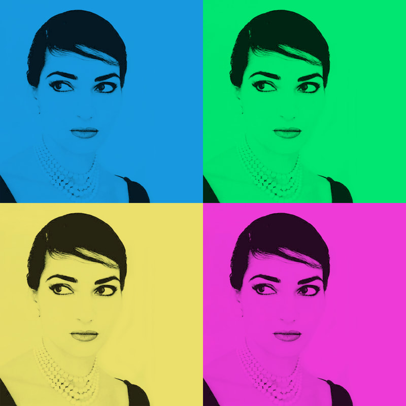
This was a Photoshop assignment for my class at MSU. We had to play with pop art colors and use the same image four different times to create a pop art piece similar to the works of Andy Warhol.
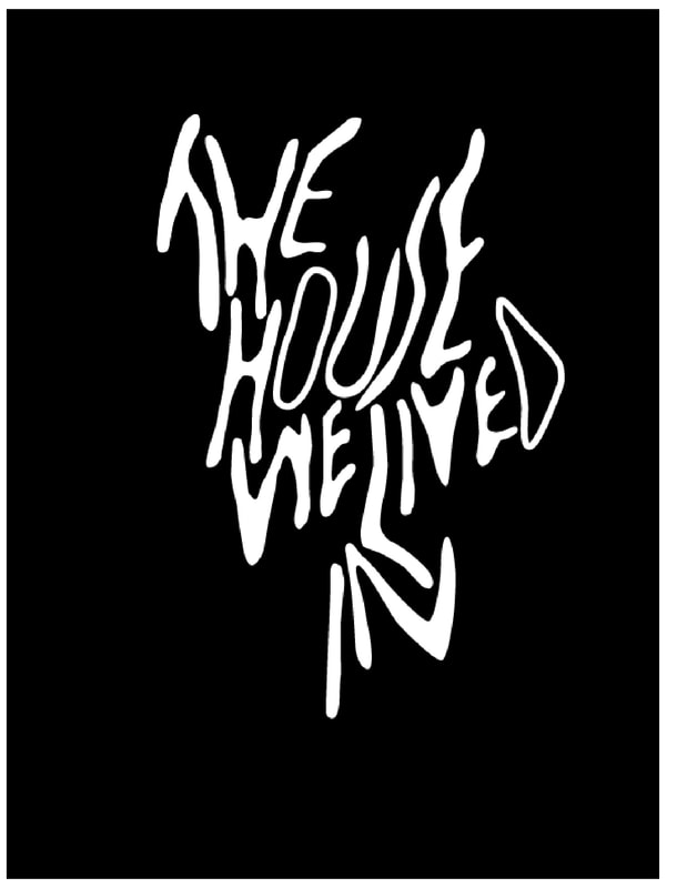
This a font that I had constructed alongside my post art department manager Ali Obemayer. We both had to come up with a font to put on T-shirts for the short film The House We Lived In (2018) in our Fiction Film Class Capstone during my senior year at Michigan State University. We had brainstormed a lot of different looks for the font and she had sent me a type of wording that we both agreed fit the style of the film. It was created on Adobe Illustrator.
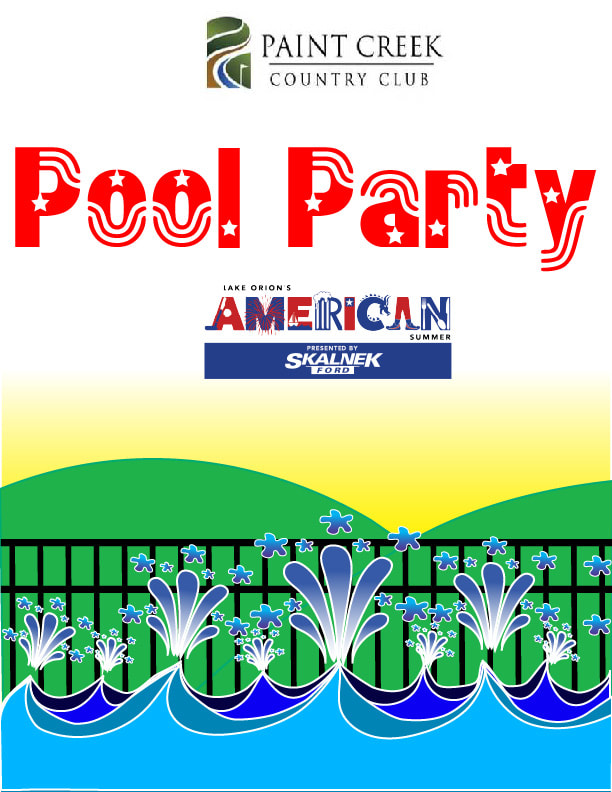
This was a graphic design flier I had made for a pool party event for Lake Orion American Summer in Lake Orion, Michigan. This was to promote a pool party event and express a patriotic and American summer fun time during that event.
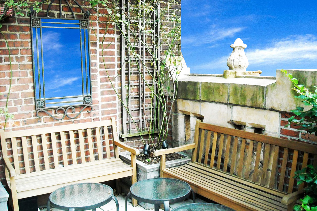
This was a Photoshop assignment for my Media Photography class at MSU during my senior year. We had to edit out the view from the balcony, where it was originally a view of another building, and it is now a bright blue sky. We also edited the window to make it look like a mirror.
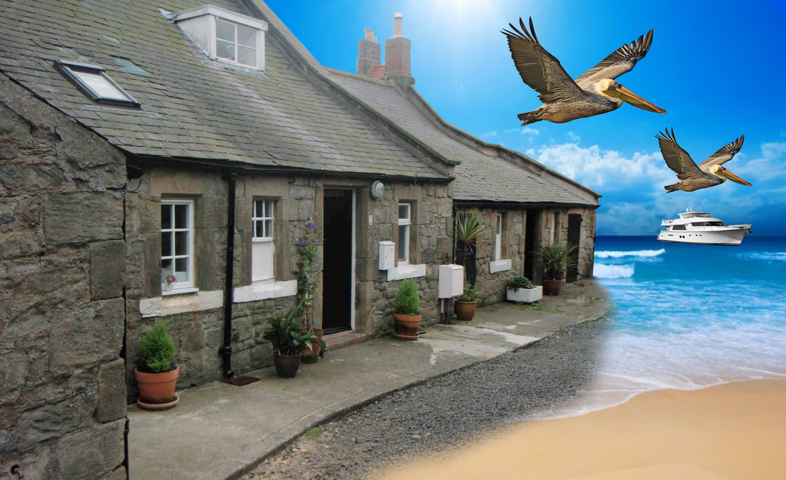
This is another Photoshop assignment from my Media Photography class. This was to showcase our use of tools that are available in Photoshop and how to manipulate perception within a photo.
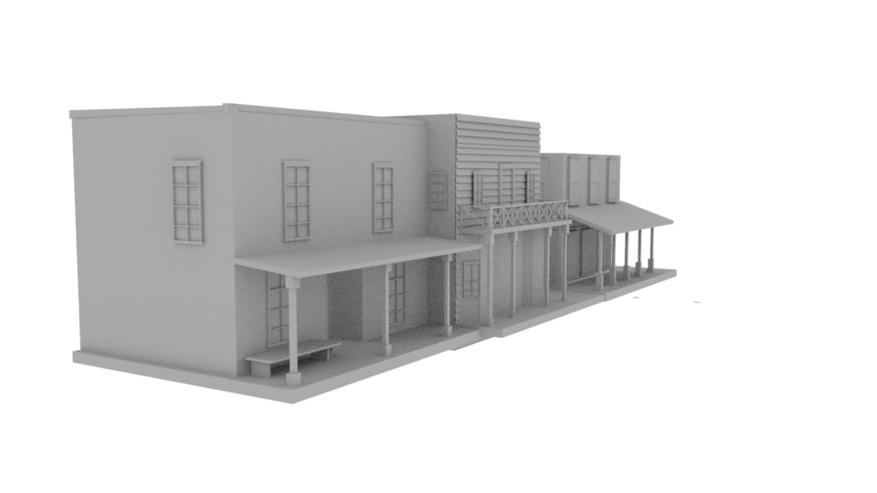
Created this for my Intro to 3D Graphic and Design class during my senior year at Michigan State University. This was created on Maya Interface Software. This is to showcase my ability in working with this software. I wanted to recreate a Western town.

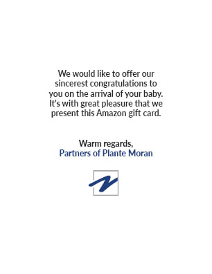
This is a congratulations card that I made while I was at my internship at Plante Moran. I was assigned to make a baby card for staff members who are expecting a child. Inside the card had a customized message congratulating the staff member of the arrival of their baby while also containing an Amazon gift card. I took graphic vectors off the website Shutterstock, downloaded text, and changed the colors to the brand of Plante Moran.

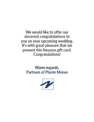

This is a congratulations card that I made while I was at my internship at Plante Moran. I was assigned to make a wedding card for staff members who have recently wed. Inside the card, there is a customized message congratulating the staff member on their marriage and contains an Amazon gift card. I took graphic vectors off the website Shutterstock and changed the colors to the Plante Moran brand. I also downloaded text for "Congratulations!" and juxtaposed all the images and text to create a minimalist approach.
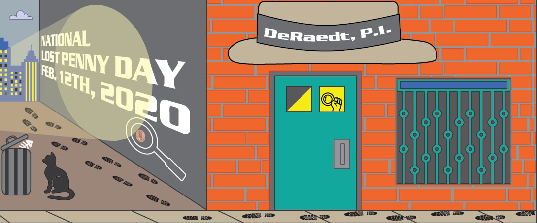
This is a calendar illustration I made for one of the months of the year during my internship at Plante Moran. The assignment was to celebrate a specific funny holiday made up by people for one month of the year and make a company based around it. National Lost Penny Day on February 12th, was the day assigned to me. I went in the direction of making a private investigation company for each staff member. DeRaedt is my last name, so for everyone who would receive this calendar would have their last name put up on the fedora hat with "P.I." at the end of their last name. I took inspiration from old fashioned film noir films and old 80's neo-noir tropical detective shows like Miami Vice or Magnum, P.I.
